


Preqin Pro is a browser-based data platform that inform institutional investors, funds managers, service providers, and other industry professionals with insights on the alternative asset industry. Preqin first started collecting data in the Private Equity space in 2003, and has expanded over the years to other alternative asset classes such as Real Estate, Hedge Funds, Infrastructure, Private Debt, Natural Resources, and Secondary Markets.
As part of the redesign / rebrand that began in 2017, the company wanted to revamp the browser platform and streamline workflows to keep users engaged. As a Product Designer collaborating with designers, product owners, and engineers based in London, I was responsible from strategy to execution on the user flows around search.
One point of friction that we identified through client interviews and user analytics was that customers have mutliple tabs opened at once to view one profile. Over the years, Preqin expanded initially from a singular private equity database to a multi-asset class database where a profile (ie. state pension fund) gradually branched out to 5-7 sub-profiles. The pain point was evident once a customer searched for a particular profile and arrived to a results page where they would see multiple rows of the same profile name, but only differing based on asset class type.
Therefore, in order for a customer to see a holistic view of a fund manager or investor, they would either have to open multiple tabs at once or jump back and forth between sub-profiles and the results page which ultimately slows their workflow and navigation throughout the platform. This process would be cumbersome when the user tries to download or print a profile since they would have to print from multiple browser tabs.

In order to gain more insight and understand how our customers approach search, I performed a competitive analysis of other data providers and other leading financial services websites:
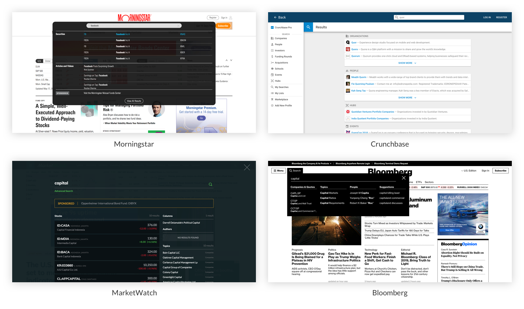
A commonality across all four websites was that search results were grouped according to certain categories (ie. Stocks, Bonds, People, Events, etc.). During our ideation phase, we went forward with this categorical pattern would clarify our quick search and reduce any redundancy in our search results.
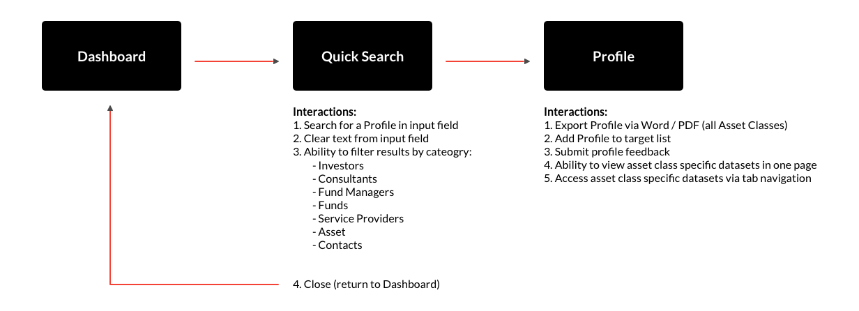
Based off of user interviews and competitor analysis, our first iteration focused on removing the duplicate search values for each sub-profile and incorporating a category grouping system (ie. by Investors, Fund Managers, Funds, etc.). The previous sub-profile pages that existed in the previous user flow have been consolidated into one page in which you can access each asset class via a tab navigation system. This new userflow would allow customers to quickly scan through matching results via category and quickly jump into profiles without the need to transition back and forth between profile pages and search results.
The main feedback that we received from this iteration's user testing was that since the category groupings were displayed vertically, customers' search values of interest often were hidden beneath the fold, unless they typed out their search query to completion. Another observation that we discovered was that the 'View All' button was rarely clicked on at all which would expand the container group showing more than the first 4 intitial results.


In response to our first iteration and initial round of user testing, we decided to implement a horizontal category approach and have the default search results tab to be an 'All' tab in our second iteration. The 'All' tab shows all matching results across all categories and this would address the constraint of only viewing 4 results per category.
In addition, we also wanted Quick Search to always be accessible anytime the customer is looking throughout the platform so we embedded the Quick Search field within the top nav instead of being within the body of the page.


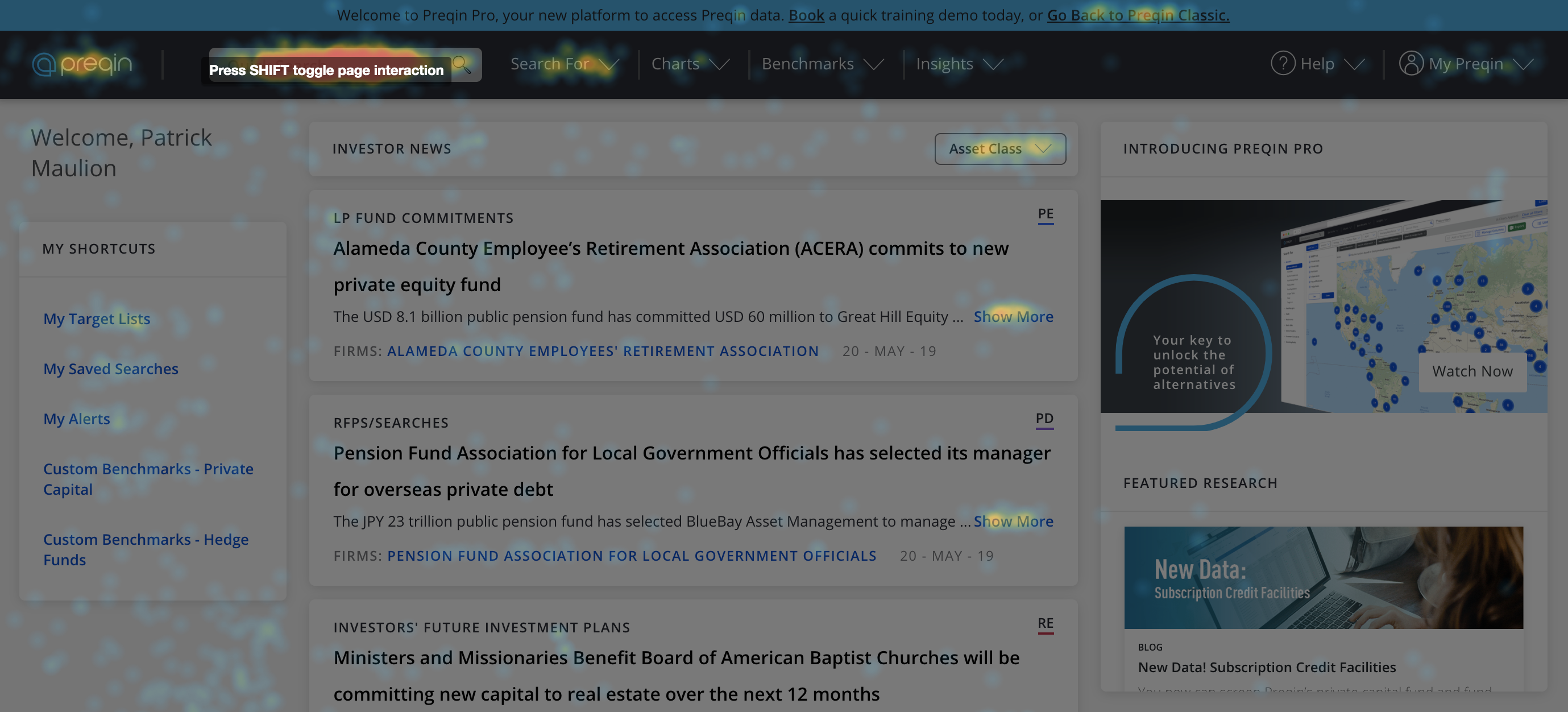
According to our user data analytics since our launch of Preqin Pro, we have seen solid traction of Quick Search - being the #1 clicked element after user login, accounting for 35.5% of all traffic. Quick Search continues to be the main driver throughout the platform, and we have received positive feedback on the redesigned user journey:
Moving forward, we continue to iterate and enhance our quick search based on user feedback. Possible areas that we could enhance our current quick search would be adding an asset class indicator stating informing the customer what asset classes a profile is covering before clicking into the profile, or even thinking beyond the scope of profiles and expanding the search capability throughout the platform (ie. Search for Benchmarks, Insight Articles, Conferences, etc.)
