


Preqin Benchmarks are one of the core ways for our customers (both Investors and Fund Managers) to help understand their investments and see how their portfolios stack up against their peers. With the nature of alternative investments privately recorded and only surfacing high-level information to the public eye, Preqin Benchmarks provide a transparent view of fund performance for the alternative assets industry.
As a lead Product Designer within the R&D Innovation Lab, I conducted user research / testing sessions, created new user flows, and provided prototypes showing the newly added functionality of plotting funds onto Preqin and custom benchmarks on Preqin Pro.

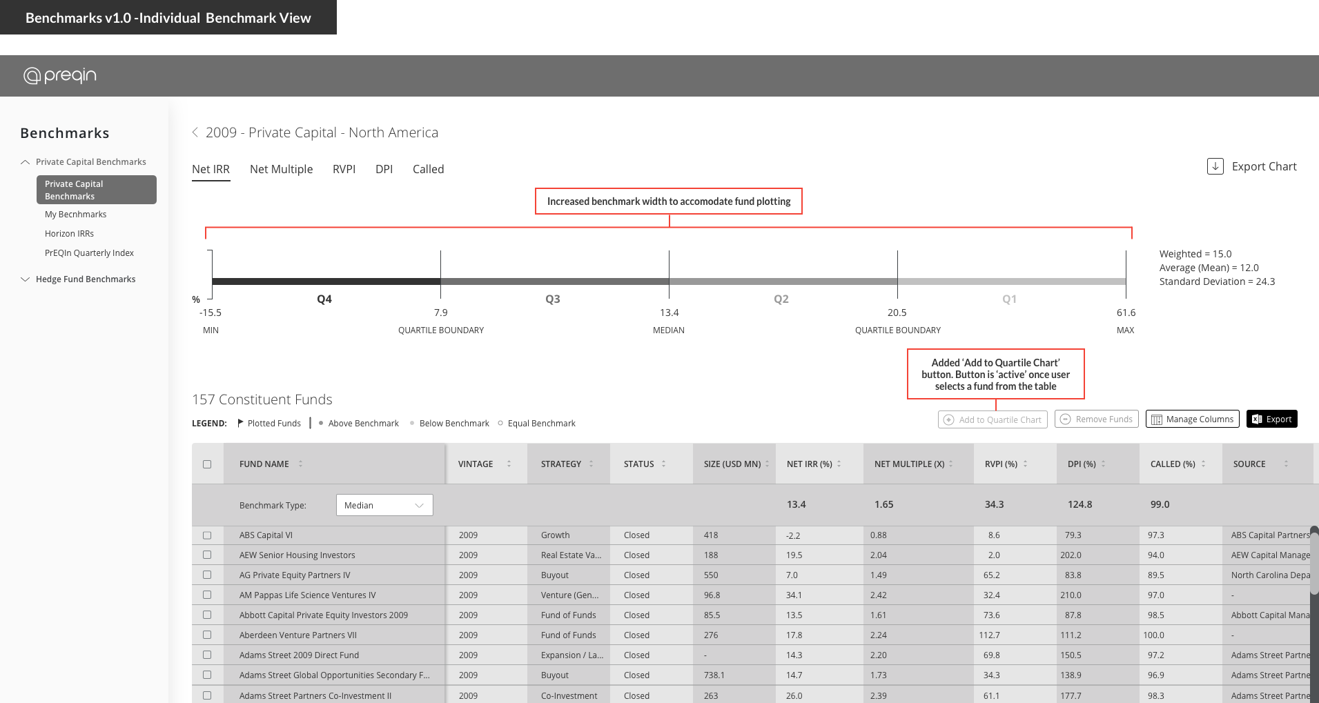
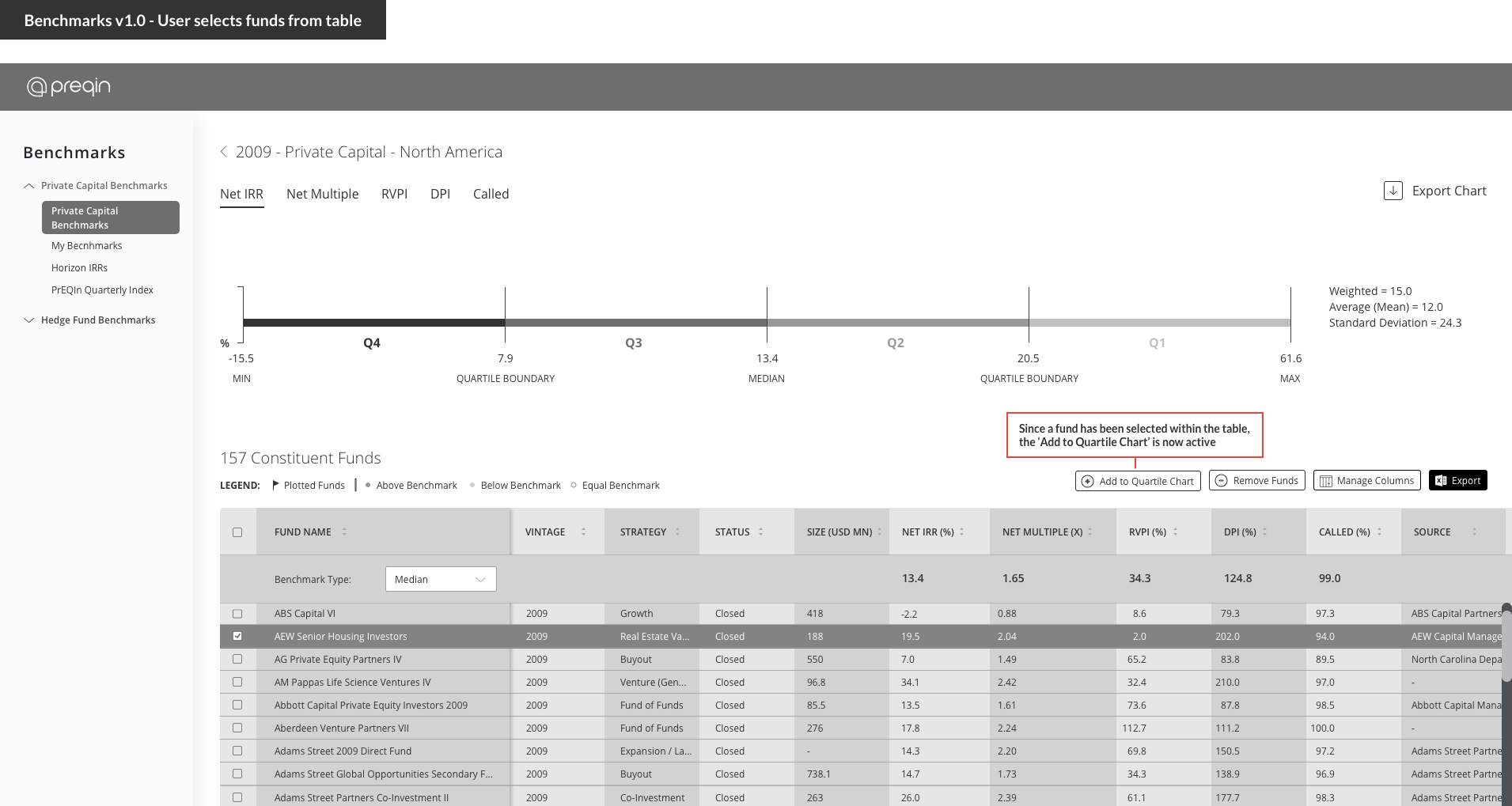
In our first version release of Benchmarks on Preqin Pro, a benchmark view would consist of a brief quartile chart followed by a table below that would list each constituent fund of that benchmark. Since our launch, customers have appreciated this new look & feel since the quartile chart displayed aggregated performance stats at the top and the supporting table below displayed each individual fund contribution to the benchmark.
However, investors and fund managers requested to see how their own portfolio investments stack up against these benchmarks. Allowing the customer the ability to see their funds within a benchmark would be a value-add for marketing purposes and investor-client presentations. Therefore, through customer feedback, the new challenge was exploring how to incorporate the functionality of visually plotting funds onto Preqin and custom benchmarks.
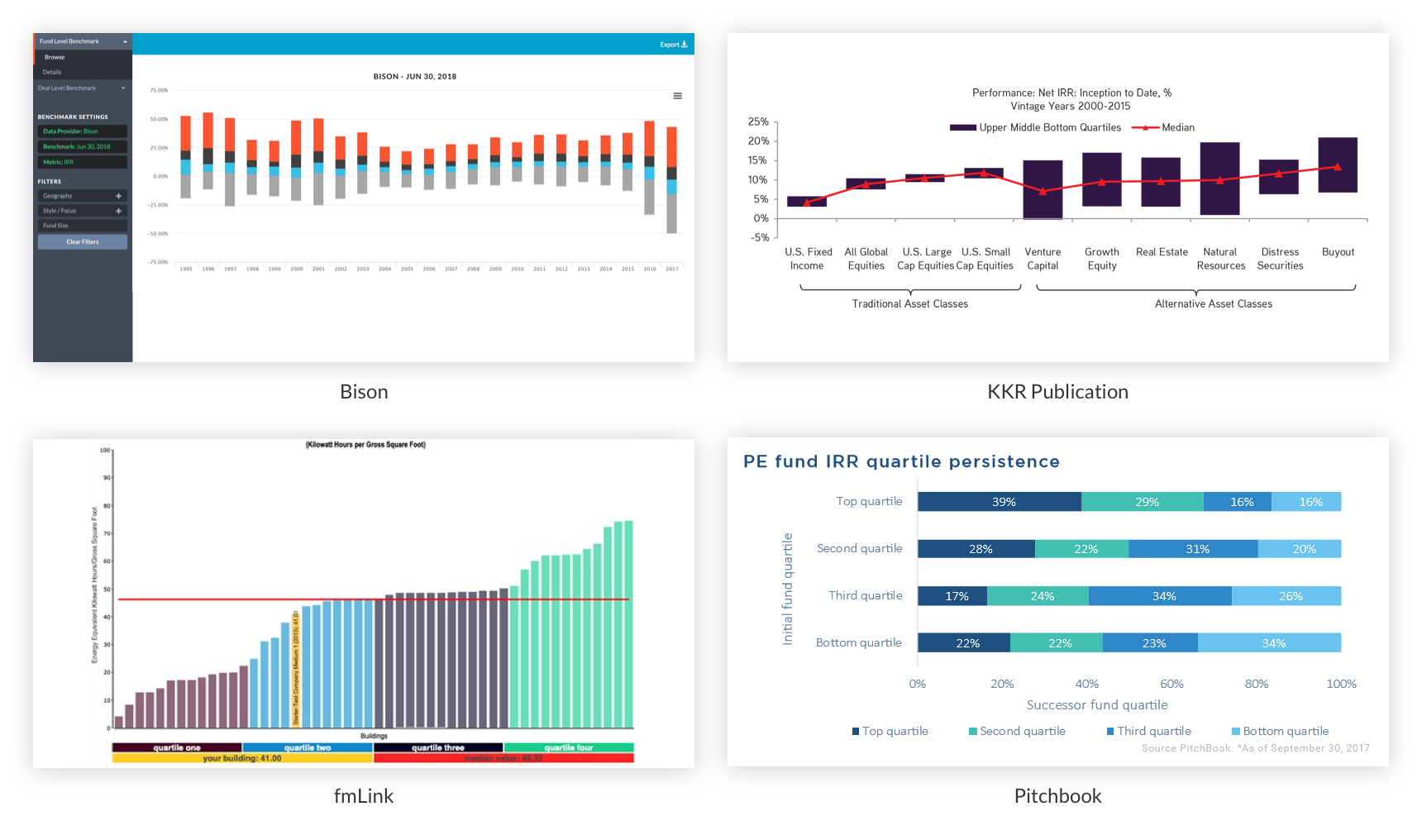
It was important to get an idea how our customers perceive benchmarks in the alternative asset industry by looking at other data financial service providers and even private equity related publications from fund managers. From our review, benchmarks were typically displayed in a box-and-whisker variation displaying each quartile, however there were not many examples of having the ability to pin-point an individual datapoint.
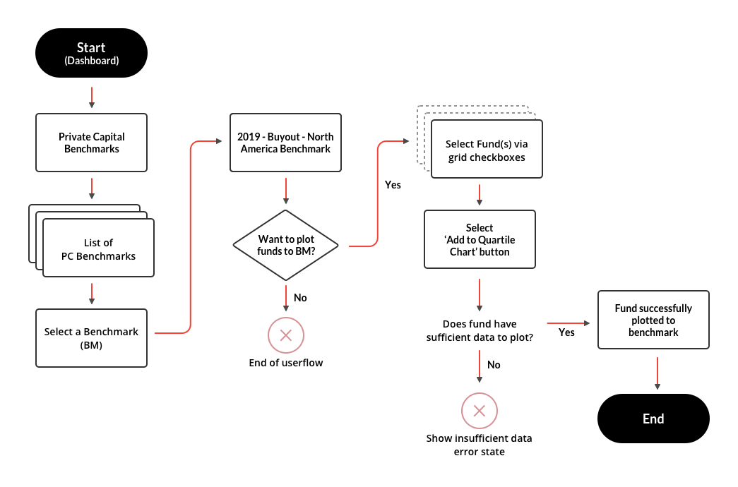
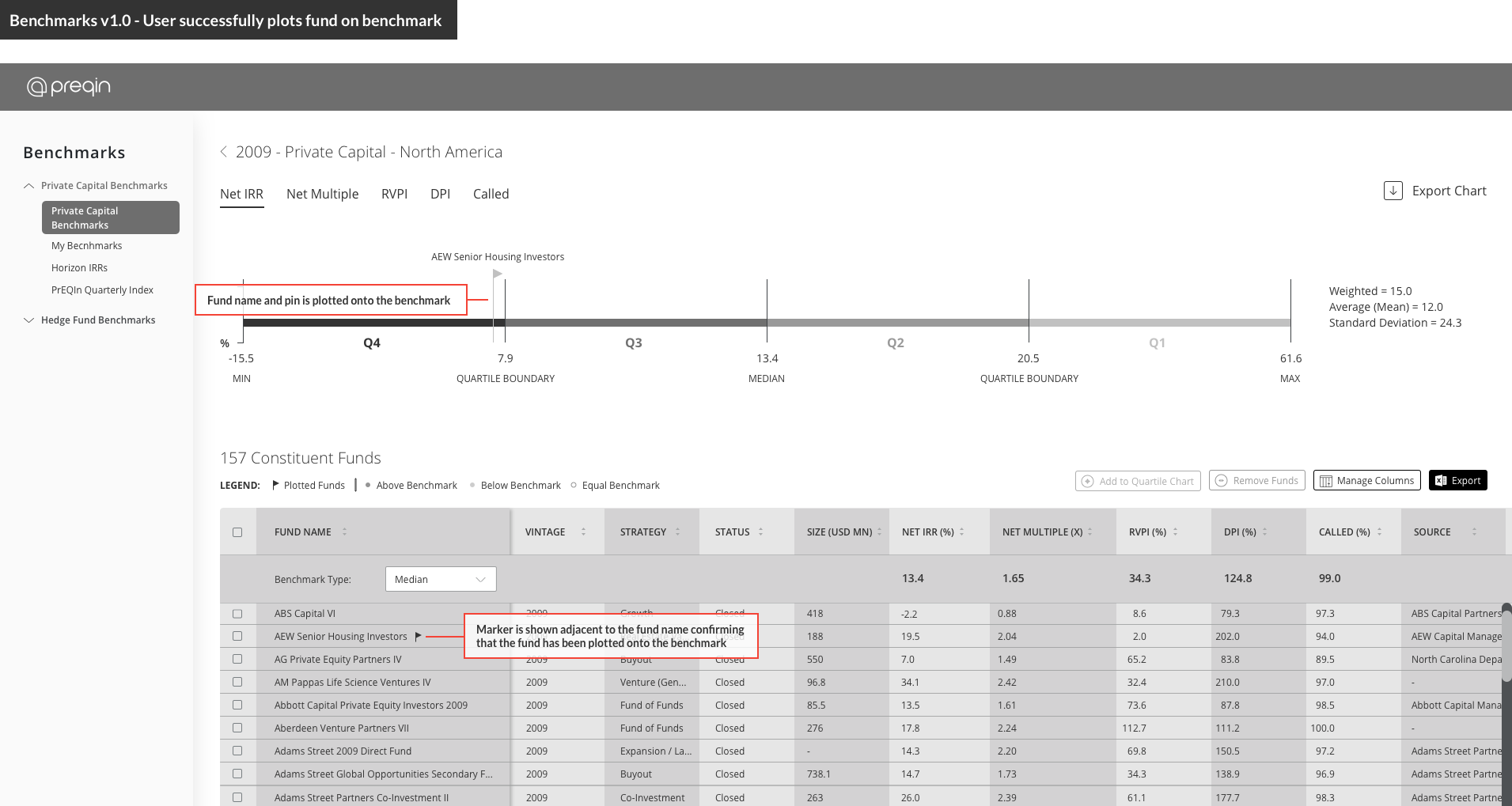
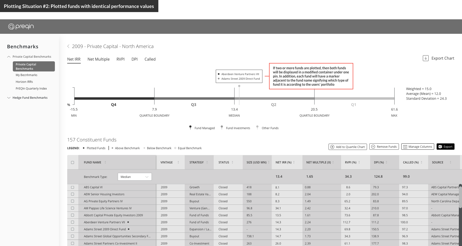
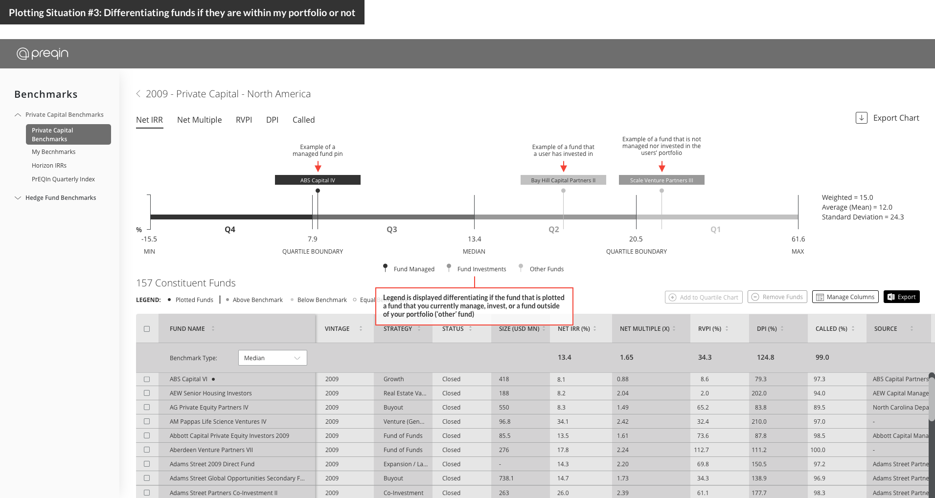
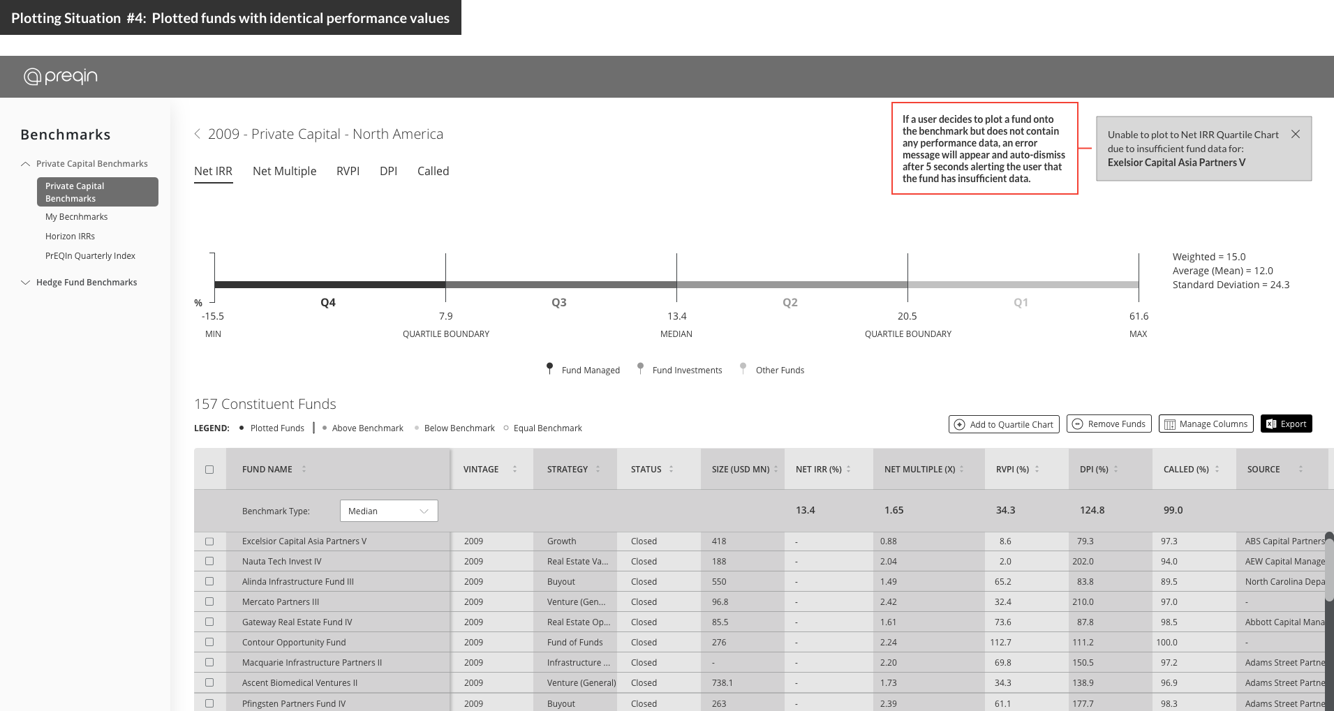
Before any wireframing / prototyping, we wanted to identify the most efficient path to plot funds within a user flow diagram. There are a plethora of ways to include this type of functionality into the platform via modals, slide-out menus, etc. However we wanted to channel our customers through consistent table user flows that they were familiar with in other areas of the platform. Therefore, we decided that our customers select a checkbox of a particular fund in the table which would then activate the 'Add to Quartile Chart' button at the top right. If the selected fund had sufficient data according to the performance metric selected (ie. Net IRR, Net Multiple, etc.) then the fund would be successfully plotted onto the chart. If the selected fund did not contain any value, then an error alert would appear.
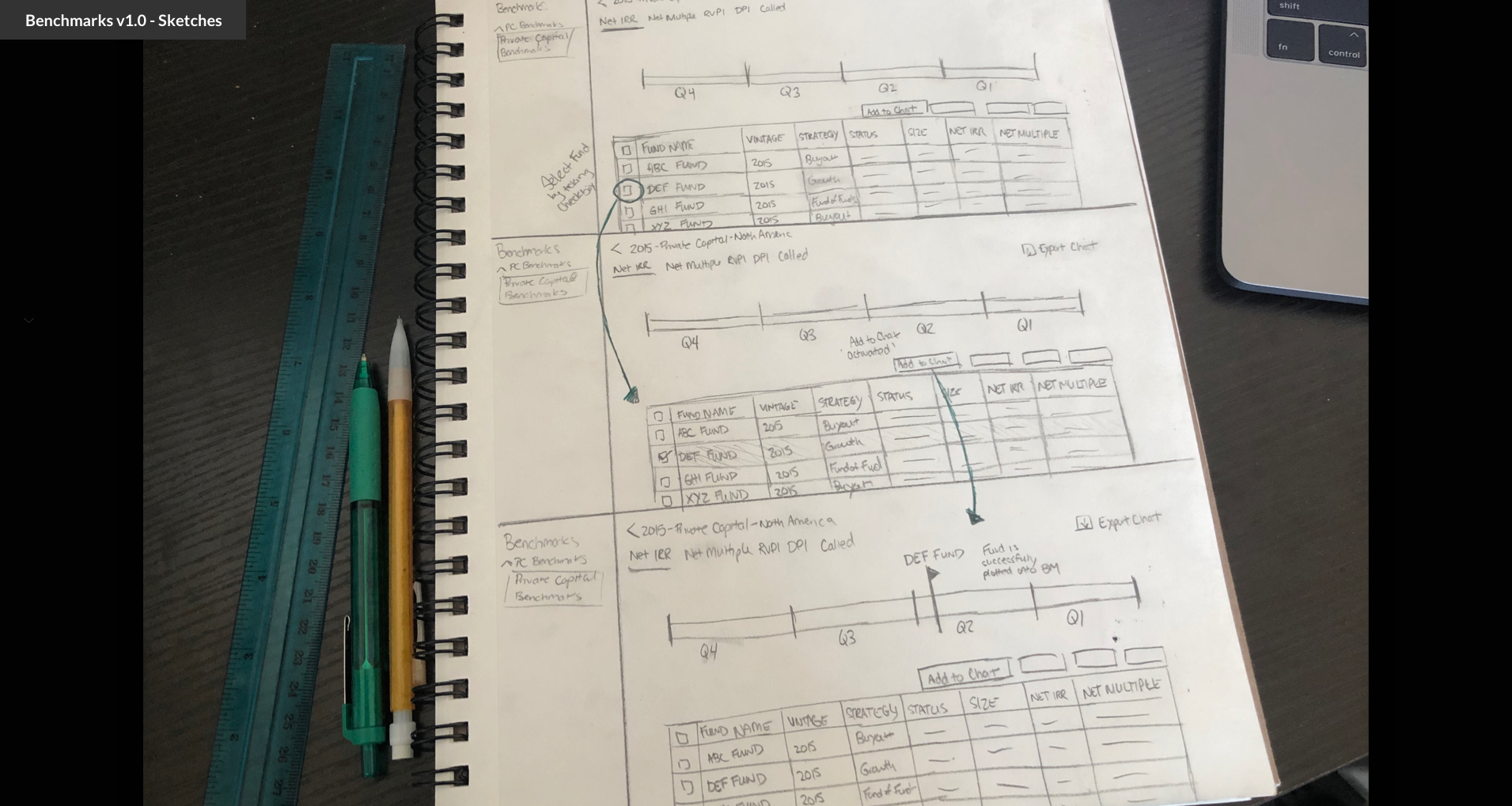
In order to validate whether customers would truly want this feature of plotting funds onto benchmarks we decided to test our initial wireframes in front of customers. Our user-testing sessions were mainly task-based and one of our tasks introduced the concept of adding funds directly onto the benchmark.
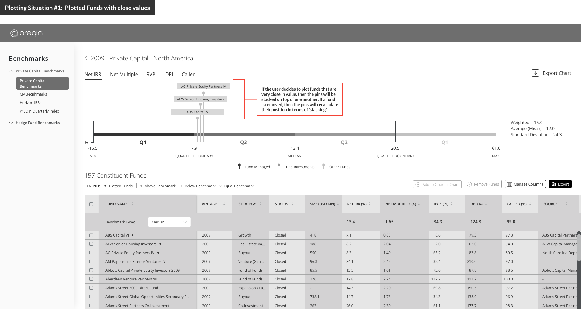
The overall sentiment behind plotting individual funds onto benchmarks was positive and multiple customers stated that they would use this functionality to quickly compare how their portfolio investments are performing against Preqin's Benchmarks or their own custom benchmarks. However, we needed to account for several fund plotting situations before handing off this feature to engineering.
Plotting Situations:
-
How would plotted funds appear if two or more funds are very close in value?
(ie. Fund ABC's NET IRR = 1.20 and Fund XYZ's Net IRR = 1.25) - How would plotted funds appear if two or more funds contain the same value?
- How can I differentiate if the funds that are plotted are funds that I manage or invest in my portfolio?
- What should the user expect if the fund they selected did not contain any performance data?
- How do I remove a fund from the quartile chart?

Since the addition of fund plotting functionality to Preqin Benchmarks, we have seen about 129 customers interact with the new feature and rank as the '57th' click event on the platform. The ability to plot funds onto Preqin & custom benchmarks has been a heavily requested feature from our customers and has helped them in their day-to-day workflows.
~ US Investment Consultant "
~ USD 7 Billion US Pension Fund "
~ MayBank (Malaysia Bank) "
~ California US Public Pension Fund "
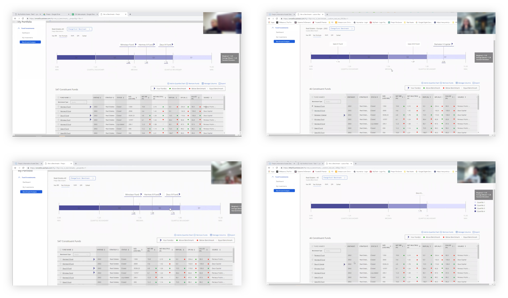
Since deploying the ability to plot constituent funds onto individual benchmarks, customers have been curious to see how their funds stack up against not only an individual benchamrk, but also mutliple Preqin / custom benchmarks. Having the increased visiblity of a single or multiple funds plotted against an array of benchmarks would provide further insight in their due diligence processes and augment reporting material for both investor / fund manager presentations.
